

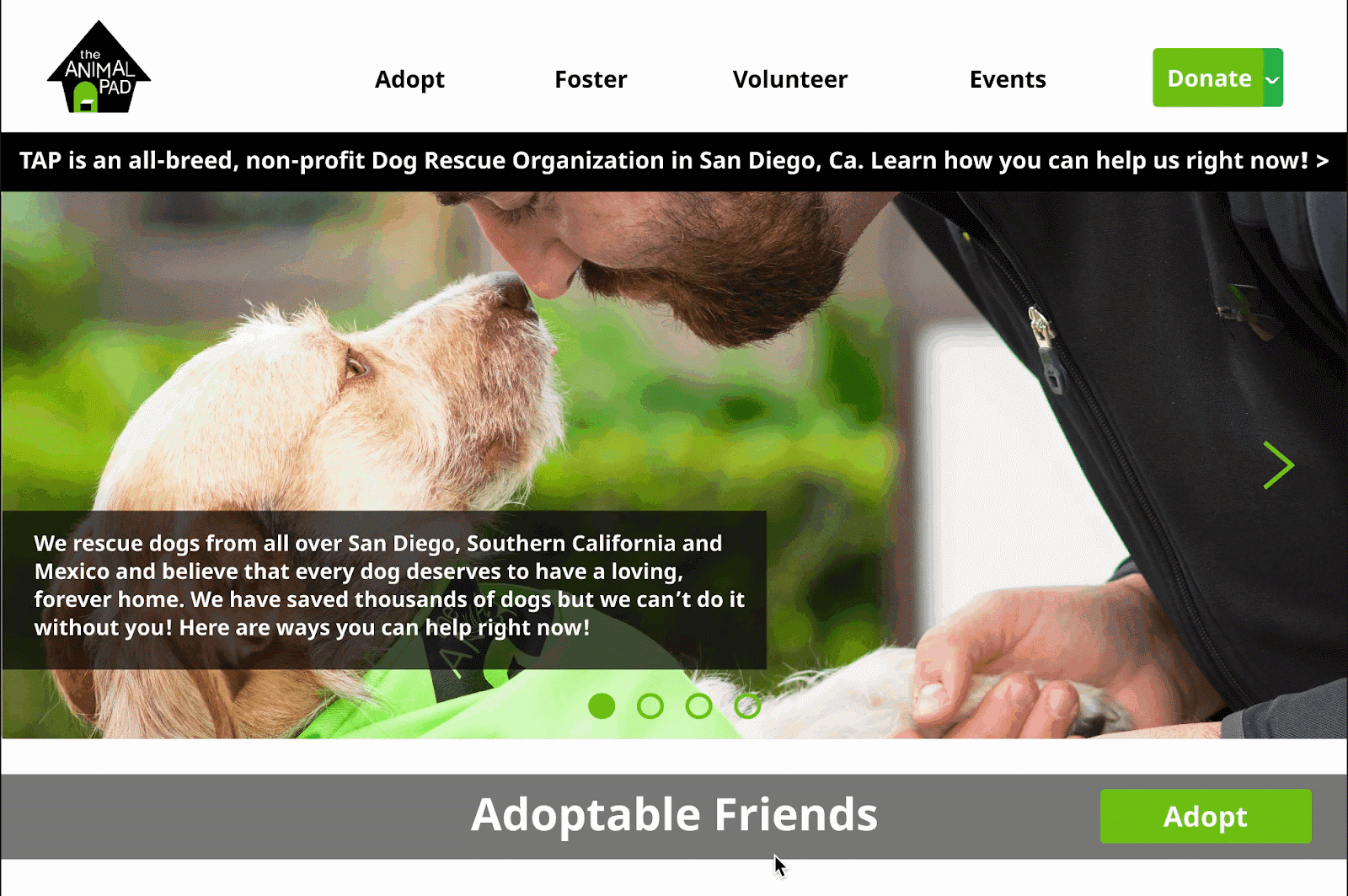
This program is under Design for America’s To Be Designed program. In this two-quarter-long project, my team partnered with a San Diego local non-profit dog rescue organization, The Animal Pad, to redesign their website.

The Animal Pad (TAP) is a non-profit, all-breed dog rescue that focuses on saving dogs from high-kill shelters and the streets of Mexico. From vet care to finding them forever homes, TAP has developed a large rescue network for dogs in Baja California, as well as a sister shelter in Ensenada.
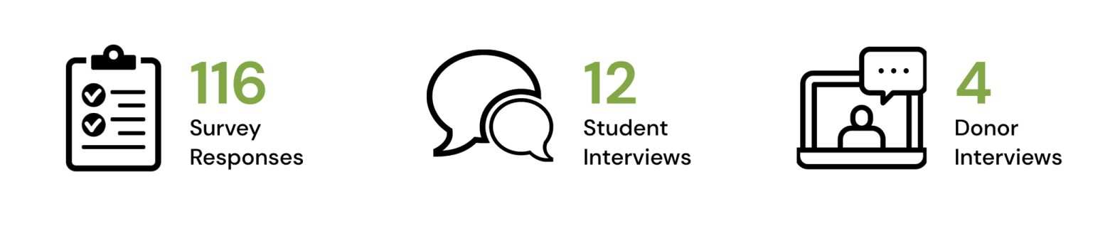
Survey Results
We mainly asked our recipients about their preferred donation styles, methods and how would they become more willing to donate to an animal shelter.


Findings
Form the research, we found out that users really value these three things when donating to an animal shelter:
🌟 Transparency of the donation process
🌟 Credibility of the organization
🌟 Significance of the donation
Interviews


Personas


Donation Page Iteration

From research, we found out that other methods of donation other than direct donation were not visible enough. Other methods of donation are ignored by users when scrolling down on the donation page.

In the Lo-Fi prototype, we added a drop-down donation button that allow users to choose between direct donation or exploring other options of donation. Also, we created a new footer for the page that added information about methods of donation and the option to sign up for the mailing list.
User Testing: Some users are not able to discover the dropdown function of the donation button. However, if they do, they find it useful to discover other methods of donation.
In the Hi-Fi prototype, we redesigned the dropdown part of the donation button to bring attention to the dropdown function. Also, on the donation page, we moved other methods of donation from the top bar under the direct donation frame and highlighted the texts green.
User Testing: Adding a different color for the dropdown part of the button increased traction toward the dropdown itself. Also, people were finally reading the methods of donation in the donation page.
Photography For a Cause Page Iteration

The original Photography For a Cause (PFAC) page includes information from other methods of donation which was confusing to users. Also, the pictures were outdated and not delightful. The original website is not focused enough on the donation method, Photography For a Cause (PFAC). It includes SFAC inside the website which is confusing to users. Also, the pictures on the page are low quality and not delightful.

The Lo-Fi prototype of PFAC showcases a more focused page for the method of donation. We focused the page solely on PFAC and created spaces for the photographer to showcase their dog pictures.

In the Hi-Fi prototype, we redesigned the dropdown part of the donation button to bring attention to the dropdown function. Also, on the donation page, we moved "other methods of donation" from the top bar to the direct donation frame and highlighted the texts green. Last but not least, we inserted high-quality pictures with brighter and more vibrant colors.
Shop For a Cause Page Iteration

The original Photography For a Cause (PFAC) page includes information from other methods of donation which was confusing to users. Also, the pictures were outdated and not delightful. The original website is not focused enough on the donation method, Photography For a Cause (PFAC). It includes SFAC inside the website which is confusing to users. Also, the pictures on the page are low quality and not delightful.

The Lo-Fi prototype of PFAC showcases a more focused page for the method of donation. We focused the page solely on PFAC and created spaces for the photographer to showcase their dog pictures.
We wanted to focus on comparing the hoverable information boxes and the traditional layout of information. So we created both high-fidelity prototypes for these two and conducted AB testing.


Type A is similar to the low-fidelity prototype in which we created hoverable information boxes with activatable overlays on top of them. As for Type B, we created a categorized page that lays out all information about ways to shop for a cause. We also created shortcuts on the top of the page to allow users to navigate promptly to a specific part of the page.
User Testing: Most of the users were still concerned about memorizing the information for Type A therefore most users are favorable towards Type B due to its easy navigation and informative layout.
Be Patient
It is easy to be attached to the design you spent much time on. But you just have to be prepared to be denied and rejected no matter how good it looks to you. We always have to remember that our priority is our client.
Be Relentless
We have to be able to come back into Figma and fix things over and over again to reach our goal no matter how small or seemingly irrelevant it is from your perspective. The small changes can lead to a great impact on the design as a whole. Therefore, I learned to be more relentless when it comes to implementing feedback into the design.
Be Outspoken
During group discussions with my team members, I realized how helpful it is to simply think out loud to facilitate brainstorming. It does not have to always be a perfect idea; anything can be inspirational to others around you. Every thought is valuable to the design process.
Prototype Handoff & Stay in Touch
Next, we will hand off the prototypes to the engineers that code the website for the Animal Pad. If they ever have any questions regarding the prototype, they are welcome to contact us through Slack and we will be most willing to assist them to help build the website.
Here are some adorable pictures from Photography For a Cause :)


