

We interviewed a total of 14 students regarding the current in-app functions, user experiences and usability and below is the qualitative data we collected.

Moving on with the qualitative we collected, we realized that we needed a way to process every designer's data. Therefore, we decided to utilize affinity mapping to organize pain points that we identified during interviews. The affinity mapping told us that the main issues we should address are visual and content redesigning.
After narrowing down our focus on these two aspects of the design, we dissected each aspect into more points to help us better ideate on creating our solutions.

After talking to the users during interviews, we gained a better insights into Triton 2 Go app's users. Therefore, we created two personas to serve as representations of our target audience.
On the left, we have Michael who is a student who needs a favorite order function, hates the reward system and has food allergies. On the right is Emily, a first year student who is a foodie that likes to explore different dining halls on campus. She needs a streamline ordering experience, a useful map function and also an easy way to find specific orders.


After we identified our main users and their needs, we wanted to learn from other food ordering apps hoping to further discover functions that the Triton2Go is lacking. I created the chart below to make the comparison process easier to understand. Afterwards, we finalized on our how might we statement in able to provide our team with a clear mission statement and design direction.

In order for us to have a structured idea of user's in-app navigating experience, we created a user flow chart. The element introduction on top shows what each element shape represents. We eventually came up with a total of three major flows –– map function, reward system, and order functions.

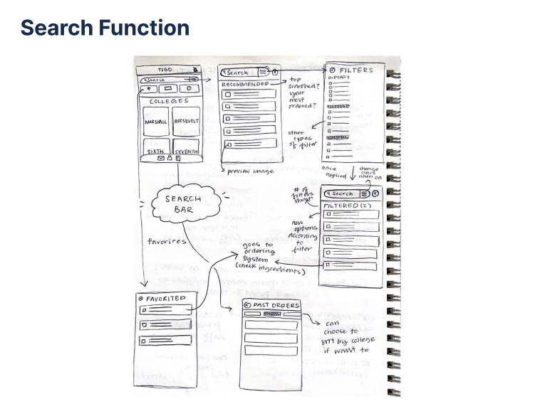
From here, Amy and I took on the rewards and map functions while Dianne and Cindy took on home page and the search function.
In this sketching phase, I sketched out the map function with the idea of incorporating functions of Google maps. I wanted users to be able to not only find dining halls on the map but also have the ability to order meals through the function.


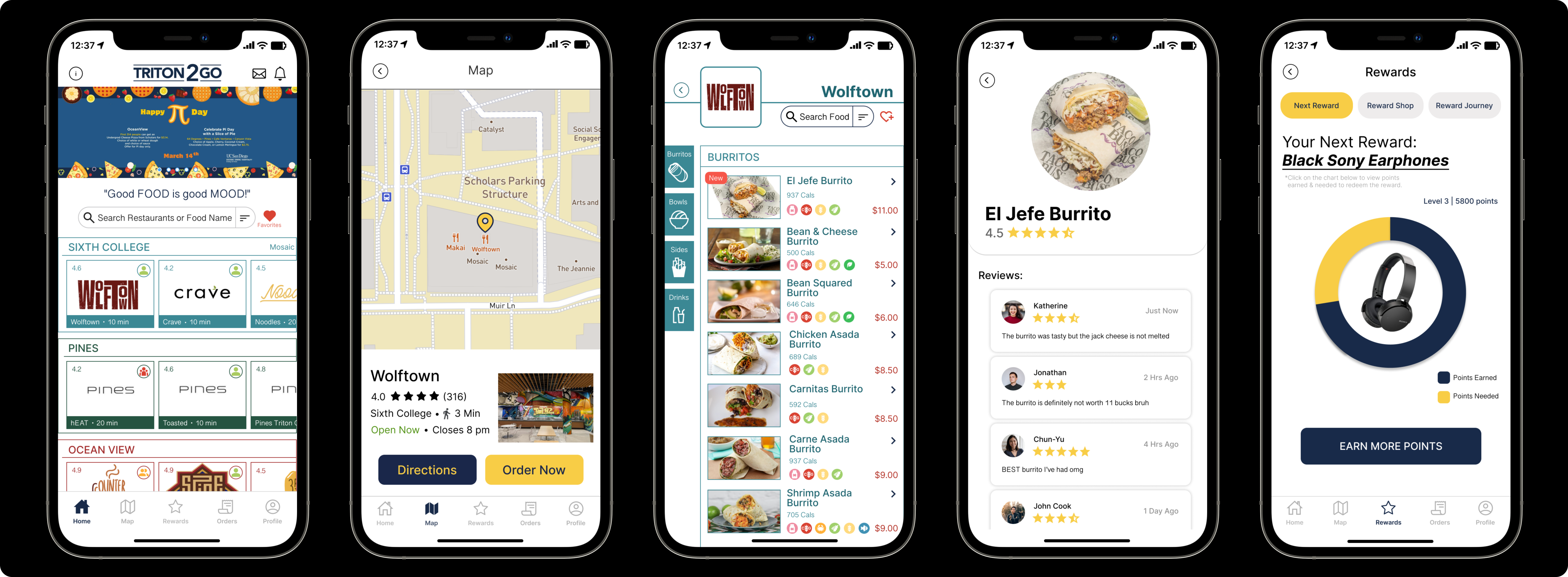
After we finalized our sketches, we quickly transformed our ideas into wireframes on Figma. I was in charge of creating wireframes for the map function and also one landing page for the reward system.
For the map function, I was able to create a interactive scrolling function after some self-learning. As for the reward landing page, I wanted to make the reward more engaging and attracting so I highlighted the reward journey progress at the center of the screen, hoping to direct more user's focus toward it.


Since Amy and I each worked on designing a reward landing page, hoping to explore different layouts and ways to engage our users with the system. My design was the pie chart while Amy's was the progress bar with active rewards & reward redeeming history.
We both recognized merits in each other's designs so we could not really make a decision to go forward with one design and abandon the other. Therefore, I decided to conduct A/B testing with more users to try and solve this problem. As a result, we decided to combine the pros (listed below) that users identified during my interviews.
I created the design integration on the right. I created switchable tabs on top of the page which introduces users to the reward shop to redeem rewards & reward journey to view reward history. Last but not least, I placed "earn more points" button at the bottom for users to directly start earning points after viewing their current reward progress.
As a result of user needs, we created several new functions. On top of each block below, I provided quotes we collected from user interviews that inspired each of our designs.


We also redesigned several functions and pages to make the app look more engaging, interactive and usable. The frames on the left of each block signifies the frames before the redesign; the right frames are products of our redesigns.


This team was one of the most straightforward but also respectful one I have worked with. It made me realise how efficient meetings and discussions can be if we do not hide any concerns or ideas that we have. Speaking up never has to equal rudeness. The worst ideas are the ones that were left untold.
During our project, we experimented with a lot of different layouts and formats. For example, I spent a lot of time deciding on how the new rewards page should look like instead of actually trying it out on either paper or Figma. Through this experience, I learned that the best way to see if it looks good or works is to try it out yourself!

We had to complete this project in less than 7 weeks. Despite having a lot of ideas during our brainstorming phase, we eventually decided to focus on redesigning essential functions of the app first because we do not want to spread ourselves too thin and end up with a lot of low-quality products. At the end, we made the essential functions better than we expected because we evaluated our time constraints and maximized our quality performance based on that.
